


A website is a must for every business. Almost 53% of the shoppers search before making a purchase. And what’s better than using WordPress to create a website?
It is open-source, free of cost, and there’s a large community behind it taking care of the infrastructure.
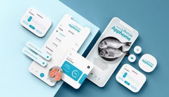
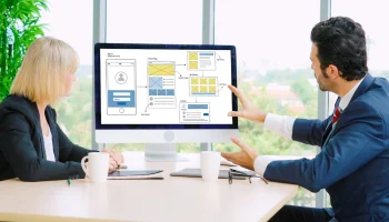
When designing a WordPress website or getting it designed by web design services, you need to take UX elements.
You can include UX element scores on your website.
But not all of them are created equal. Some should have priority over others.
In this article, learn about the five essential ux elements you must use on a WordPress website.
What Are the Benefits of User Examples in Website Development?

Before understanding the five major UX Elements, let’s understand the advantages of User experience (that we refer to as UX) in website development
Yes, you may know that UX is one critical element in website development. First, UX increases user satisfaction. User experience focuses on comprehending the needs of the user. This leads to increased user satisfaction.
The UX design considers the approach through which the users interact with a website.
This makes the user experience more intuitive and user-friendly.
Furthermore, it leads to improved usability. The users can navigate the website and find the information they require.
Another benefit of user experience is increased engagement, which is achieved by comprehending the needs of the user and creating an engaging experience. The website can build loyalty. This engagement also keeps the users coming back again and again. That’s the user experience for you.
Websites with a good UX can lead to better conversion rates. By creating an easily understandable website, users can complete tasks like filing out forms or making purchases easily.
The be-all and end-all of a business website is increasing connectivity and also brand reputation. Moreover, users are more likely to trust a brand having a website that is easy to use. The web developers pour all the necessities into the website to make it easy and interactive and intensify the experience of the users.
5 Essential Ux Elements In Website Development
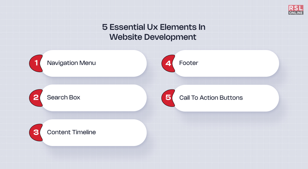
We have arrived at the main section of our discussion, where we discuss five of the major UX elements in website development. So, without any delay, let’s get into the topic.
Navigation Menu:
Your website is a collection of web pages. These web pages are interconnected, and each web page contains information about a certain topic. So, your users need to navigate from one page to another to find what they’re looking for. To make their job easier, you need to design an intuitive navigation menu.
These should be constant and present at the top of every web page. You can choose from different types of horizontal menu UX designs. Some of the common ones are:
- Standard horizontal menu
- Hamburger menu
- Sidebars
- Hover-activated dropdown menu
It would help if you planned which navigation menu would suit your website and implemented it accordingly.
Drag-and-drop plugins are available specifically for designing the menu. There’s no coding effort involved.
Search Box:
With the proliferation of search engines like Google, Bing, and voice search technologies, people are getting accustomed to search. So they’re searching for every type of information possible.
So, if you’ve got a big website with 40-50 pages or more, then the site visitors might use the search instead to get what they’re looking for.
That’s when you need a search box UX element to make this possible.
When someone searches for a particular product of information, you can be sure that he is most likely a warm lead. With proper conversion tactics, they’ll become a paid customer.
Along with the navigation panel, the search box makes your website navigation-friendly.
Content Timeline:
You may want to display your content in chronological order.
You’d have seen such content on ‘About Us’ pages where companies listed when they were founded, when they raised capital when they became profitable, and so on.
The founding date comes first, with the most current activity at the tail.
These are both fun and easy to read. To create such pages, you need to make a Content Timeline UX component.
Multiple plugins are used for this purpose. One of the best plugins is the Content Timeline plugin.
It is a paid plugin, but the features available are worth the money. The component is responsive. So it’ll work seamlessly across all devices.
Footer:
A footer is an essential component of every website. And it’s equally important.
Therefore, you should devote some time to designing it properly.
The footer is at the bottom of your page. But despite being at the bottom, it helps visitors get additional information.
A study by Chartbeat revealed that many visitors scroll down to the bottom to get information from the footer — even when the page is thousands of pixels long.
At the bare minimum, you should have contact information, address, sign-up form, social media icons, and links to other important pages.
Search engines, too, crawl the footer for such information. For search engines, you should include a sitemap that would help it crawl your website better.
Call To Action Buttons:
If you don’t ask, you don’t get it. That’s why you need to have relevant call-to-action buttons to convert leads.
For example, a CTA that reads “Sign Up” will prompt the user to take action.
It doesn’t have to be only about converting.
You should include CTA buttons in everything that requires action.
You can include a few buttons on the home page and redirect users to specific product pages. It’d be more effective than hyperlinks.
When designing CTA buttons, you should consider implementing color psychology. As per its principles, you should make the preferred options green and the least preferred option red.
This triggers the visitor to click on the green button since it signifies safety.
On the other hand, red signifies danger, and the visitor will be less excited to click on it.
When designing UX elements for your WordPress website, you should think from a visitor’s perspective.
Ask yourself what component will be more beneficial to them and where they will most probably look for it.
You can work with a reputed web design services agency and figure out the proper way to implement the elements.
Additional Reading: