







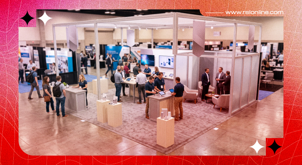
On paper, a 20×20 booth covers a vast area. The usable floor area shrinks once you account for walls, counters, equipment, storage, and walking room.
For a growing company, stepping up to this size can feel like a real milestone.
How useful that extra room feels depends on the booth assignment. In the right configuration, it can offer more visibility and easier access than a small inline booth.
There may also be room to run several activities, but the team, venue, and show plan still determine what is practical.
The catch is simple: 400 square feet fills up quickly. A few counters, screens, product units, and chairs can take over the floor before the design feels complete.
Start with the work the booth has to do. Then give each activity only the room it genuinely needs.
That could mean an arrival point, a product demonstration, standing conversations, seated meetings, storage, and clear walking routes. No standard split suits every exhibitor.
A workable plan can make it easier for staff to receive visitors without blocking an entrance or interrupting a demonstration. It cannot promise more leads, deals, or sales. Those results depend on the offer, the team, visitor volume, and many other factors beyond the floor plan.
Choosing Your Layout Style And Table Requirements
Before ordering graphics or furniture, write down what the space must accommodate. Use that list to shape your 20×20 booth layout. Visitors may need to enter, watch a demonstration, speak with staff, sit for a meeting, or move past stored equipment. Accessibility has to be considered throughout.
The booth assignment and the event brief should shape the arrangement. A layout that worked at another show may be a poor fit here.
Furniture changes how people move and how many conversations the booth can accommodate at one time. Yet an extra table does not create extra leads, deals, or sales on its own.
Practical capacity depends on the specific layout, equipment, visitor volume, staffing, accessibility needs, and venue requirements. Add a piece only when it serves a defined purpose without closing a route or blocking a view.
Choosing The Layout Of Your 20×20 Trade Show Booth
List the activities first, followed by the furniture, equipment, and storage each one requires. Only then should you sketch their positions within the available floor area.
The finished plan should respond to the booth assignment, the expected crowd, accessibility, venue restrictions, and the exhibitor’s priorities. Not a prefabricated formula.
Understanding Your 20X20 Canvas
A 20×20 footprint gives the designer options, but it can still become cramped. The problem is usually not the stated area; it is the number and scale of items competing for it.
Footprint Realities And Spatial Constraints
It is tempting to treat 400 square feet as enough room for the full product range, a private office, and a lounge. Usually, that wish list is longer than the floor can comfortably handle.
Picture the stand during a busy hour, not as an empty drawing. People need somewhere to walk and turn, products may need safety clearance, and walls take up physical space. The exact allowances will depend on the layout, equipment, visitor volume, accessibility needs, and venue requirements.
Heavy or oversized furniture can make the booth feel crowded from the aisle. Pieces chosen for the actual activities are less likely to take up space visitors and staff need.
The Impact Of Open Sides On Traffic Flow
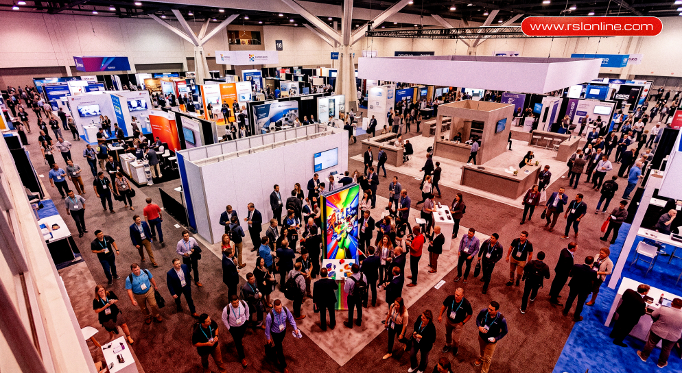
First, look at where the organizer has placed the booth and which edges face an aisle. That information changes the design more than the 20×20 label alone.
An island space may receive traffic from four directions, yet that does not mean all four sides will work as entrances once products and structures are added.
A corner space meets two aisles. Test its greeting point and most visible feature from both approaches rather than copying an island plan.
Fewer openings may help staff manage movement, but they may also cause a queue or make the stand look closed. Base the decision on the expected traffic, the layout, accessibility, and the venue’s rules.
Designing The Booth Layout Zones
It is easier to test a floor plan when each activity has a rough home. Those areas don’t need matching dimensions, and they certainly don’t need fixed percentages.
They simply need to connect in a sensible order. A visitor might arrive at an open edge, try the product, and then move to a quieter conversation area.
That sequence can change with the product, booth configuration, equipment, and how attendees are expected to use the stand.
The Welcome And Visitor Zone
Treat the aisle edge as the booth’s introduction. A passerby should be able to grasp the main message without finding a counter, screen, or staff cluster in the way.
Creating A Frictionless Storefront Boundary
Don’t close an aisle-facing edge just because the rendering has room for another structure. Decide which sides should admit visitors only after checking the booth type, the display requirements, accessibility, and the likely direction of traffic.
A compact reception counter near a busy corner may work, but it is only one option. Mark it on the floor plan and test whether people can approach, turn, and pass it without losing sight of the exhibit.
High-Impact Branding And Visual Hierarchy
Because the trade show floor is crowded, visual messaging may need to work at different viewing heights.
Where venue rules, rigging options, sightlines, and budget permit, an illuminated hanging sign can improve long-distance brand visibility.
Do not turn the eye-level backwall into a product brochure. One clear headline is usually easier to take in as someone walks past.
Slim video pillars may also be placed near the outer edge, provided they do not narrow entrances, interfere with sightlines, or reduce circulation space.
Proactive Staffing Strategies At The Edge
Visitors should be able to spot a staff member without facing a wall of people at the entrance. That may mean placing one or two team members near the busiest approach and rotating others through the booth, depending on the layout and visitor volume.
There is no fixed staffing number for the perimeter. Scheduled meetings, demonstration duties, accessibility, equipment, and the venue’s occupancy or safety requirements all affect what will work.
From there, staff can greet visitors and help them find the right demonstration or conversation area.
The Interactive Demo Zone
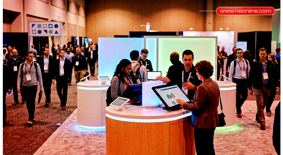
A demonstration gives visitors a reason to stop, but the demo zone itself does not guarantee leads or qualified prospects. Its usefulness also depends on the product, the presenter, the audience, and the event.
Place it where the intended audience can see what is happening without sacrificing entrances, conversation space, or safe circulation.
*Layout Styles For Software Vs. Physical Products *
A software booth might use back-to-back kiosks or presentation stands, but that is only one route.
Other exhibitors may use wall-mounted screens, individual demo counters, or a scheduled presentation area, depending on the product and team.
Plan cable routing with the venue, show services team, and exhibit builder, using an approved solution that meets electrical, accessibility, and safety requirements.
For physical goods and industrial hardware, a waist-high presentation counter can provide a practical testing surface.
Its size, height, and position should depend on the product, demonstration process, accessibility requirements, and expected audience.
Establishing The Traffic Buffer Zone
If a live demonstration is likely to draw a group, test where that group would actually stand. The position should keep spectators inside the booth while respecting the public aisle and neighboring exhibits.
A five- or six-foot gap may be useful as an early sketching assumption, but it is not a rule. Calculate the required room from the specific layout, equipment footprint, expected visitor volume, accessibility needs, and venue requirements.
The objective is to maintain safe circulation and keep attendees out of neighboring exhibits and public aisles.
Confirm the final clearance requirements with the show organizer, venue, and exhibit builder rather than relying on a universal measurement.
Interactive touchscreens or docked tablets may give visitors something useful to explore while staff is busy.
Their position still needs to work with the main demonstration, equipment, accessible routes, and expected crowd levels.
The Meeting And Negotiation Zone
Some discussions need more calm than the demo floor can provide, particularly when they cover specifications, pricing, or partnership details.
That does not automatically put the meeting area at the back. Its best position depends on the entrances, noise, storage, equipment, accessibility, and the route visitors take through the booth.
Smart Furniture Selection And Space Optimization
Furniture earns its place by supporting a real activity. A large conference table may look impressive in a rendering yet leave too little room once chairs are occupied and visitors are moving nearby.
One possible arrangement is a small table with enough chairs for the company’s typical meeting size.
Other teams may prefer standing-height tables, soft seating, or a partly enclosed room. Test the furniture footprint with occupied chairs to confirm that visitors and staff can still move comfortably around it.
The objective is to support focused conversations without dedicating more floor space to furniture than the meeting function requires.
Balancing Visual Privacy With Open Airflow
Choose between an open, semi-private, or enclosed meeting area according to the sensitivity of the discussions, expected meeting duration, noise level, and available space.
A fully enclosed room may suit some exhibitors, while others may benefit from a lighter visual division.
When full enclosure is unnecessary, semi-transparent elements such as vertical slat walls or frosted acrylic dividers can create separation while allowing light to pass through.
Greenery may also provide a visual boundary, although it should not be treated as a substitute for acoustic control.
Storage can be positioned behind a meeting wall, beneath counters, or within another underused structural area. Its size and location should reflect what the team actually needs to store without reducing access or circulation.
Crucial Mistakes Growing Brands Must Avoid
Moving up to a 20×20 trade show booth layout creates a new set of trade-offs. The following mistakes can make the space harder to use.
Over-Furnishing The Physical Footprint
Excess furniture can narrow walking paths and interfere with visitor circulation. Choose multipurpose pieces where appropriate; for example, a reception counter with built-in storage may reduce the need for a separate cabinet.
Reducing oversized furniture leaves more usable circulation space. However, the final furniture mix should still reflect meeting requirements, demonstration activities, accessibility, and staff needs.
Cluttering The Messaging Hierarchy
Displaying every single minor feature or product line creates immediate mental fatigue for onlookers passing the booth. Focus your main structural graphic panels entirely on your flagship offering or latest release.
Relegate secondary options, pricing models, and technical data sheets to interactive tablet displays or scan-to-mobile code walls.
Ignoring Electrical Safety Boundaries
Leaving presentation counter power cords exposed beneath unpadded booth carpets creates hazardous tripping conditions for visitors.
Coordinate the electrical drop points with the convention hall staff well ahead of time.
Use an approved cable-management or flooring solution for lines running to powered demonstration fixtures.
The appropriate method should follow the venue’s electrical, accessibility, and safety requirements.
Final Checklist Before Approving Your Layout
Before production begins, review the booth as a working space. Not as an empty, polished rendering.
Check the official show map, identify the sides that genuinely face traffic, and compare them with the proposed entrances.
Next, view the graphics from each likely approach. Confirm that the main message remains readable and that counters, equipment, or structural elements do not hide it.
Match the proposed power locations to the demonstration equipment and meeting-area needs, using the electrical solution approved by the venue and show services.
Then simulate a busy period with the intended staff, furniture, equipment, and a realistic visitor volume. Treat any working dimensions or capacity assumptions as illustrative until the exhibit builder, venue, and relevant show services confirm the layout meets accessibility and safety requirements.